When it comes to interior design, one of the first things people think about is color. The color of the walls, the color of the floor, the color of the furniture, and art and accents– there are so many options and choices to make that it can be overwhelming. How do I choose just one color? How do I know it will look good? How do I add more colors without it looking too busy? Many end up either playing it safe and ending up with an uninspired space– or giving up and either not doing the project or paying someone else to do it for them. BUT! With a bit of basic color theory understanding and some confidence, it is easy to pick your colors yourself and end up with a unique and stunning result!
Color Theory
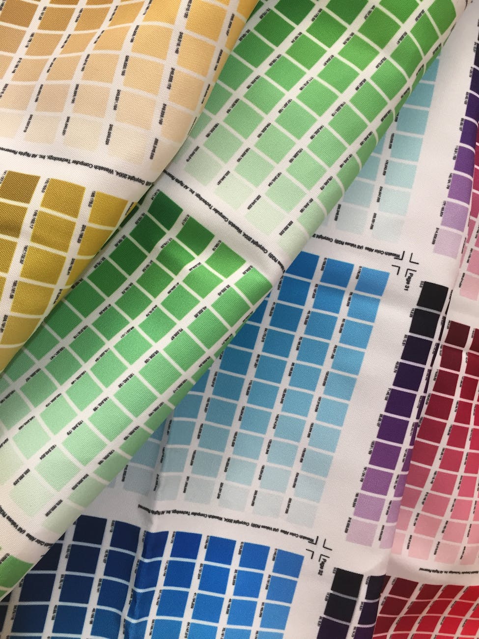
Color theory is a rather extensive topic that takes years to master, but through learning the basics of it you can put together some color schemes yourself that look great! The first thing to learn is cool tones vs. warm tones. On the surface, this topic follows what you learned in school– red, orange, and yellow are warm tones while blue, green, and purple are cool tones. Once you get that, you can take it one step further by thinking about undertones. Undertones refer to the place on the spectrum of color that each shade leans toward. If a red is closer to purple than it is to orange, it is cool-toned. You can see this in most cherry reds. If a red is closer to orange than purple, it is warm-toned. You can see this in hot Cheetos. This concept applies to every color and can be visually understood through the color wheel. Once you get the hang of it, you won’t even need the wheel anymore!
How to use it
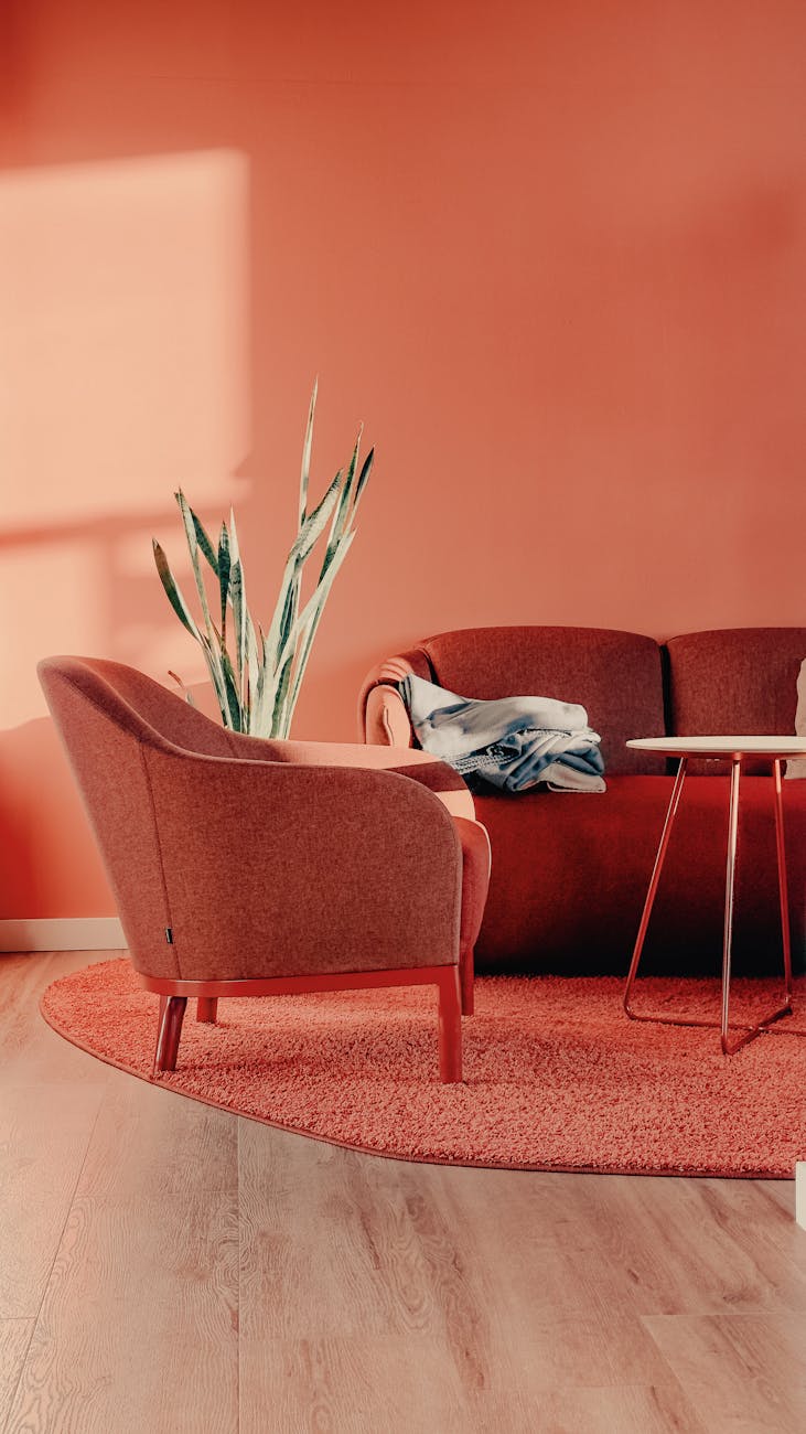
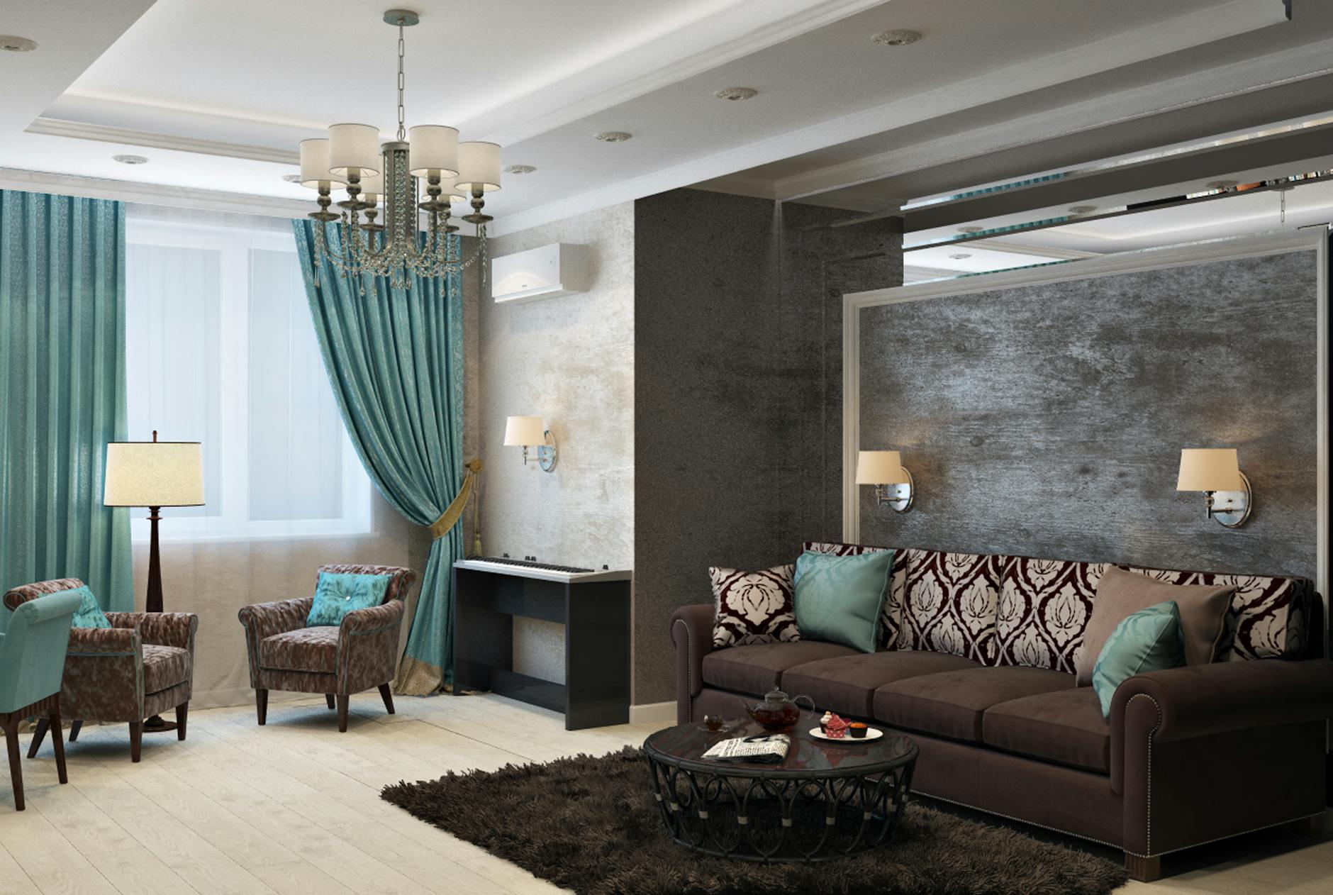
It is generally recommended to stick with either warm tones or cool tones, although, with some skill, they can be effectively combined to make a truly innovative and interesting space. If you want to test out some color ideas, try holding all of the swatches next to each other to see how they interact and go from there. It is also recommended to utilize the 70-20-10 rule when picking your accents and furniture. This means that 70% of the room should be your main color (usually the walls, trim, and big furniture), 20% can be your secondary color (the main furniture, textiles, and even the floors or an accent wall), and 10% should be your accent color (art, little details, pillows, or hardware). This may seem a little formulaic and uninspired, but depending on your chosen colors it is a great way to experiment on your own home without investing too much money on a design that doesn’t end up working out. Additionally, while it is a great rule of thumb to stick with these parameters you can definitely play with different shades of the same color to add intrigue and movement.
Combos
The combination of colors really depends on what you want to achieve with your style, where in the house you are designing for, and what your personal preferences are. Some examples of successful color combinations can include brown, orange, and green for a mid-century look, light blue, brown, and white for a french farmhouse style, or red, black, and purple for a dramatic and moody Gothic modern vibe.
At the end of the day, color is a crucial part of the design process, but it doesn’t have to be as mysterious and daunting as it is made out to be. Trust the science, and dare to go against it at times. Have fun with it, and when in doubt, look at what is trending to see if any of it speaks to you–or send me an email and work with me 🙂
PS I HAVE MOVED TO SUBSTACK IF YOUD LIKE TO FOLLOW 😀 SEE YOU THERE 🫶🏼

Leave a comment